
CHAPTER XVII.
GRADATION, ABRUPTNESS, TRANSITION, AND PROGRESS IN PAINTING, SCULPTURE, AND ARCHITECTURE
Gradation in light and shade—
In color—
Abruptness—
Transition—
Connection between these methods and curved, angular, and mixed effects of lines—
Reasons for the extensive presence of curves in nature and art—
Why the curve is the line of beauty—
The most common curve of nature is a literal fulfillment of the method of gradation—
As well as all the methods of artistic composition—
Curvature as applied to the general contour of groups in painting and sculpture, especially to the limbs of the human form—
In architecture—
Why curves are less used in this art—
Gradation in combinations of lines or contours—
Abruptness in the same—
Gradation in the outlines of architecture: spires, towers, foundations—
Over openings—
In Italian towers—
Lines of lower and upper window-caps, gables, and roofs; rounded arches below and pointed above—
The more pointed arches below—
Abruptness less appropriate in architecture than in painting and sculpture—
Progress in painting and sculpture: false methods of obtaining the effect—
Right methods—
In architecture—
Conclusion.
It still remains for us to examine the influence of gradation, abruptness, transition, and progress upon the arts of sight. Here, as in all cases, gradation is one of the means of carrying out the requirements of principality, central-point, and massing. In the treatment of light and shade, it causes the brilliancy of the coloring, from the point where there is the greatest degree of illumination, to become less and less intense till it passes, into shadow. “Music,” says Ruskin, “must rise to its utmost loudness and fall from it; color must be graduated to its extreme
[The Genesis of Art-Form by G.L. Raymond, chapter XVII, page 278]
brightness, and descend from it; and I believe that absolutely perfect treatment would in either case permit the intensest sound and purest color only for a point or for a moment.
But gradation in color is not confined to the use of light and shade. It is employed in connecting hues essentially different, the outlines of which, except when greatly illumined, are seldom perfectly distinct. At most places, especially where the shade rests, the color of the object, by imperceptible degrees, is merged into that of other objects. Effects are thus made to accord with those perceived in the external world, as already noticed on page 268. But. it is important to bear in mind, too, aside from this, that, in looking at any collection of objects, our eyes arc generally attracted to the place where the chief light falls, and while they are fixed upon this place, we see very indistinctly objects that are not in it. The endeavor of the artist to represent the appearance of things when the eyes are fixed thus upon one of them, is that which justifies his making this more bright and prominent as contrasted with its surroundings than seems to be the case in nature. But this seems so in nature, because, when observing it, our eyes look not at one thing, but glance restlessly from it to other things.
It is hardly necessary to add that the requirements of gradation are not so universally applicable as to exclude an occasional use of abruptness manifested by sharp contrasts of colors. As a rule, the brighter the light illumining an object, the more distinctly are its peculiar colors revealed and the darker are the shadows cast by it upon surrounding colors. In such conditions, the lines that separate one shade from another are very clear, and the representation of these necessitates placing one color
[The Genesis of Art-Form by G.L. Raymond, chapter XVII, page 279]
directly against the other, with no suggestion of gradation. As a rule, however, colors that are placed together even in this abrupt way must be such as naturally harmonize.
But sometimes, of course, they cannot harmonize, nor be made to do it, and then it is important to consider the method of transition. When this cannot be effected, as in gradation, by changing the colors themselves, and causing them to approach each other by regular degrees, either the course must be adopted which was described on page 251, under the name of interchange, or else a color harmonic with both, must be placed between them. Here is the way in which this latter method is described by Charles Blanc, in his “Grammar of Painting and Engraving,” chapter xiii., as translated by K. N. Doggett. In speaking of the use of color, he says: “In one of the pendentives that so magnificently decorate the Library of the Corps Legislatif, the executioner who has cut off the head of John the Baptist is dressed in red and blue, two colors whose juxtaposition is softened by a little white, which unites them without sacrificing the energy suitable to the figure of an executioner. Thus we realize a rare harmony, that of the tricolor flag. Zeigler has observed that this flag, spread out horizontally, represents a discordant whole, but through the effects of the folds the quantities become unequal, and, one color dominating another, harmony is produced. The wind that agitates the stuff in varied undulations makes the three colors pass through all the attempts at proportion that an intelligent artist can make.”
As applied to the use of lines, gradation, abruptness, and transition respectively are the principles, the developments of which lead to curved, angular, and mixed effects. A line in art indicates a certain direction. Gradation is that
[The Genesis of Art-Form by G.L. Raymond, chapter XVII, page 280]
which produces a change by regular degrees. When the character of a line is changed by regular degrees we have a curve. If it be changed without regard to these degrees we have an angle; and if it be changed both with and without regard to them we have a mixed effect.
Gradation is so common in nature and art, that we should expect the same to be true of the curve which represents it in outline. Such is the case. All the conditions of sight tend toward this result. The retina, on which every image of the external world is impressed, has a rounded surface. So has the outer eye. In consequence of this, the field of vision, lying before any one glance of sight, can be inscribed in curves. So, if sufficiently remote, can all objects even though their outlines are not curved,—objects like the hills that circle the horizon, or the tail of the comet in the sky. If we examine a small object near at hand, we see all its outlines distinctly in the degree in which these conform to the rounded shape of the organs of vision. If we look at the centre of a wheel, every part of its tire is equally visible. If we look at the centre of a square, its four angles, in the degree in which it is large, are indistinct. Hence, for a psychological reason, because, in such cases, the mind can more readily perceive and understand what the contour is, curved forms afford the most satisfaction. It is not strange, therefore, that the same Power that formed the eye has conformed to its requirements most of the outlines of the natural world.
When, in addition to this, we consider the unending possibilities of variety afforded by the curve, and the infinite suggestions of direction pointed out as by fingers of light wherever it deviates from a straight line, we know enough to account for the fact universally conceded
[The Genesis of Art-Form by G.L. Raymond, chapter XVII, page 281]
the curve is the line of beauty. This is true whether applied to separate parts of objects or to their wholes, to a single leaf or to a cluster of leaves, to a branch or to a cluster of branches, to a tree or to a grove, to a particular object that may be examined near at hand, or to general outlines described by trees and rivers in the distance. The same is true, too, of every member and limb, as well as of the whole body, of every bird or animal. All these natural objects are beautiful, largely because of the infinite number and variety of their curves.
 [click here to enlarge image]
)
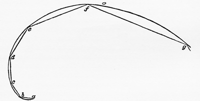
Fig. 91 – Curve exemplifying gradation.
(See pages 282 & 284)
It is well to notice, too, that, as a rule, the lines of curvature in natural objects are not perfectly circular, any more than the lines of radiation or parallelism are perfectly straight. On the contrary, the most common outline in nature is said, by Ruskin, “Modern Painters,” vol. iv., p. 5, chap. 17, to be a curve so described as to have a constant tendency to become straight, although it may never become so. Figs. 91, above, and 92, page opposite, according to him, represent curves of this description.
[The Genesis of Art-Form by G.L. Raymond, chapter XVII, page 282]
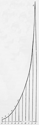
In Figure 91, the angles at a, b, c, d, and e are in each case the same, the line a—b, becomes regularly shorter than b—c, and so on. In the direction of g, the curve a—g evidently inclines more and more to differ from the requirements of a circle, and any small portion of it, to conform more and more to the direction of a straight line. In Fig. 92, the distance between the lines A—a and B—b and C—c, etc., is the same, but the curved line a—b becomes regularly shorter than b—c, and so on. It is evident that in this figure the curve a—g, while constantly approaching the form of a straight line can never become one.
 [click here to enlarge image]
)
Fig. 92 – A curve exemplifying gradation.
Why curves of this kind are seen so frequently in nature, and why, when they are seen, they are considered especially satisfactory, has been often asked. Can the question not be answered in this connection by saying that the “constant tendency” to become straight which they manifest causes them to fulfil, perfectly, the requirements of gradation. Notice, too, that in doing this, they necessarily fulfil the requirements of most of the other methods developed from comparison. In the first figure, the angles at a, b, c, etc., are the same, and in the second figure the distances between the lines A—a, B—b, C—c, etc., are the
[The Genesis of Art-Form by G.L. Raymond, chapter XVII, page 283]
same. The principle of repetition, therefore, enters into these curves, notwithstanding the constant tendency that they show to move in the opposite direction. Each of the curves, too, is so constructed that any given part of it can be magnified so as to represent exactly f—g. There is therefore a sense in which these curves are in accordance with the method also of consonance. It is not necessary to show that if they involve repetition and consonance, they involve, as well, almost all, if not all the other methods that on page 131 are associated with these.
From what was said in Chapter X. in connection with central-point as related to the laws of perspective, as well as of symmetry in Chapter XI., we must infer that the principle of curvature must be fulfilled in successful art, not only in such a way as to cause the separate objects represented to seem to have the same rounded appearances as in nature, but in the arrangements of objects as related to each other; in other words, not only in imitating particular forms but also in composition, where many different forms not actually curved in nature are put together. It would not be pleasing, for instance, to see a group of human figures so arranged that a straight line drawn across the top or bottom of it would touch the crown of every head or the toe of every foot. The eye seems to require an arrangement whereby the more central heads shall be a little higher than those on either side of them; in short, whereby the general contour of the group as a whole shall be curved, and similar in this regard to the contour of flowers, trees, groves, mountains, living creatures, and, in fact, of almost all natural objects, whether animate or inanimate.
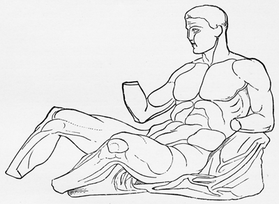
In painting, as also in sculpture, as can be shown from such works as the “Theseus,” Fig. 93, page 285, most
[The Genesis of Art-Form by G.L. Raymond, chapter XVII, page 284]
marvellous effects are owing to the way in which the infinite curves that make up the contour of the human form are rounded and blended, exemplifying thus not only gradation in the curves, but transition in the mixed lines. Besides this, the nose, elbow, knee, and heel all sufficiently illustrate abruptness. There are those who, in view of the apparent fulfilment of law in all such cases, think that
 [click here to enlarge image]
)
Fig. 93 – Statue of Theseus.
(See page 284)
the whole form and its separate parts can be-drawn according to mathematical principles underlying the laws chiefly of curvature. D. R. Hay, in his works on the “First Principles of Symmetrical Beauty,” and on “The Human Figure and the Human Head,” has given an ingenious and exceedingly interesting series of drawings intended to prove that this is so. He tries to show, too, that
[The Genesis of Art-Form by G.L. Raymond, chapter XVII, page 285]
Greek sculpture was developed from principles similar to those that he unfolds. For reasons that it would he irrelevant to give here, he is probably mistaken in this latter opinion. The proportions of Greek sculpture were by no means the same in different products and periods; showing that although, like our own, the Greek artists may have had their theories with reference to the subject, these were not universally accepted. A large part of their success in practice, too, must have been owing, in strict analogy with what would be true in our own time, to rare perceptive powers and to exceptional opportunities for observing the unclothed human form afforded by the baths, festivals, and sports of the period. But there is much in what Mr. Hay says that is suggestive and instructive.
In architecture, the methods of curvature are applied to only a limited extent, and mainly to the decoration of interiors, where the processes employed, as when laying out parks and gardens, are more allied to drawing and painting than to building. The Greeks, indeed, in order to carry out the laws of perspective, made many of the apparently horizontal lines of their buildings slightly curved, but in doing this they can scarcely be said to have applied the methods of curvature to exteriors, their object being not to make any lines appear curved, but to prevent them from appearing so.1 Of course, there are curves used in architecture, as in rounded arches and domes; but these are not so frequently, as in the other arts, curves that have a constant tendency to become straight. They are usually larger or smaller arches of regularly constructed circles. The purely artistic reason
1 See page 176.
[The Genesis of Art-Form by G.L. Raymond, chapter XVII, page 286]
for this absence of curves is that too much variety of this kind is less desirable here than in the other arts.
Painting and sculpture imitate the forms of nature, and if an artist find irregularity in these, this fact is an excuse for his copying it. But the forms of architecture are not imitated. They are originated by man, as a result of that faculty of the mind by which he reduces to systematic unity and order appearances that do not manifest these in nature. In such circumstances, if architectural forms do not show unity and order, and show it in a marked degree, they simply do not accomplish the end for which they were designed; and nothing that does not do this can be called a success.
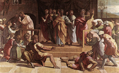
Gradation is manifested not only in the use of single lines but of combined ones as, for instance, in series of curves and angles, the different sides of which depart in regular degrees from exact parallelism. In his cartoon depicting “The Death of Ananias,” Raphael, (Fig. 94 page 288) causes the terror of the principal figure to be manifested in similar attitudes of the figures on both sides of him, but as they gradually recede into the background, their expressions and attitudes become less and less indicative of the feeling at the centre of interest.
In fulfillment of the same method, both in painting and sculpture, the hundreds of curves that together constitute the contour of the human body are made to pass into each other, causing its members gradually to expand or taper. Yet there are places, as at the heel, where the transitions are very abrupt. The number of these is often increased with great effect by the introduction, in connection with both living figures and foliage, of scarfs, bands, girdles, and folds in the drapery, or of rectangular lines of archi-
[The Genesis of Art-Form by G.L. Raymond, chapter XVII, page 287]
 [click here to enlarge image]
)
Fig. 94 – The Death of Ananias – cartoon by Raphael.
(See pages 72, 144, 257, 287, 297)
[The Genesis of Art-Form by G.L. Raymond, chapter XVII, page 288]
tecture which in pillars, entablatures, niches, and pedestals surround or support the figures. See those on PP. 30, 74, 121.
Both these methods have a place too in architecture. All must have noticed that perpendicular lines when car-
 [click here to enlarge image]
)
Fig. 95 – Doorway of a church in Jak, Hungary.
(See pages 180, 291)
photo credit: Darinko (Wikipedia)
rried into the air, as in the case of two sides of a square tower, seem to approach each other; also that when two sides of a roof actually touch, they support each other. Evidently artists are only carrying out hints from these facts when they widen the sides of a tower's base and
[The Genesis of Art-Form by G.L. Raymond, chapter XVII, page 289]
 [click here to enlarge image]
)
Fig. 96 – Arch in the Aljaferia of Zaragoza, Spain.
(See pages 37, 180, 291)
[The Genesis of Art-Form by G.L. Raymond, chapter XVII, page 290]
make them narrower at the top, thus increasing its apparent height; or when they cause the sides actually to meet in the spire or steep gable at its top, thus increasing also the ease of construction. Many great buildings, like the cathedrals and palaces of Europe, are designed according to the first of these methods. The basements are made visibly broader than the superstructures, and the lines of enclosure, as they are carried up at both sides, are gradually brought nearer together. See Fig. 2, page 17.
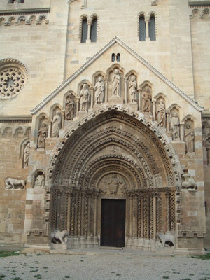
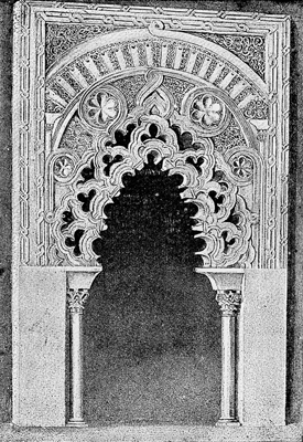
The method of gradation is illustrated also, though probably not often intentionally, in those cases so frequent in Gothic architecture, in which, over the same opening, a rounded arch is used immediately below a pointed one. An admirable adaptation of this method, revealing many successive stages of change, may be noticed in the “Doorway of a Church in Jak, Hungary,” Fig. 95, page 289. Gradation of an opposite kind, in that the sharper form is at the bottom, may be seen in “The Arch from the Aljaferia of Zaragoza, in Spain,” Fig. 96, page 290.
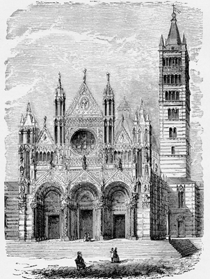
A recognition of the effectiveness of gradation as a method, undoubtedly explains the regular increase in the number of windows in each successively higher story that is common in Italian towers. Evidently their builders first recognized that the lower stories needed to be constructed more solidly in order to sustain a greater weight; afterwards, their artistic sense led them to the method of form which they adopted, and which, as all will perceive, gives to the whole a peculiarly logical and therefore orderly and unifying effect. Notice the tower of the “Cathedral of Sienna,” Fig. 97, page 292, also the front facade of the same cathedral, in which an application of this method is suggested in the difference between the
[The Genesis of Art-Form by G.L. Raymond, chapter XVII, page 291]
 [click here to enlarge image]
)
Fig. 97 – Cathedral of Sienna, Italy.
(See pages 18, 87, 207, 261, 291)
[The Genesis of Art-Form by G.L. Raymond, chapter XVII, page 292]
angles over the doors and those in the roof, the latter being the sharper.
Why is it, by the way, that this method of gradation has not been applied to facades more extensively? Why, especially in our own times, when so many are busying themselves in trying to discover a “new style” of architecture, has no one thought of developing the possibilities of this? Here is an opportunity for doing something that has never been done before. It would differ too from most things of the kind, in that it could be done in strict fulfilment of every law of the sphere in which it would be attempted. Experience has revealed that in buildings constructed of stone and brick, the low, flat arch is capable of sustaining more weight than the high, pointed one. For this reason, the former is appropriately used in crypts, basements, and lower stories. It has been found also that roofs with steep gables are the best adapted for shedding the snow that accumulates upon them in the winter of a cold climate. Besides this, it is known that when height is an object, the pointed gable or spire, all things considered, is the most beautiful as well as the most easy to construct. Between the flat arches of the first story and the pointed arches of the roof and spire there is often great difference. In order to connect the two in a manner satisfactory to artistic demands, it is strange that the artistic propriety of increasing the pitch of the window-caps in successive stories by regular gradations has not been formally recognized. For instance, the arches over the openings of the first story could be made nearly horizontal, those of the second story more rounded, those of the third more rounded still, and those of the upper story pointed.
No buildings exist, probably, that, as wholes, illustrate this method; but, if we exclude from consideration the
[The Genesis of Art-Form by G.L. Raymond, chapter XVII, page 293]
 [click here to enlarge image]
)
Fig. 98 – Rath House, Brunswick, Germany.
(See page 295)
[The Genesis of Art-Form by G.L. Raymond, chapter XVII, page 294]
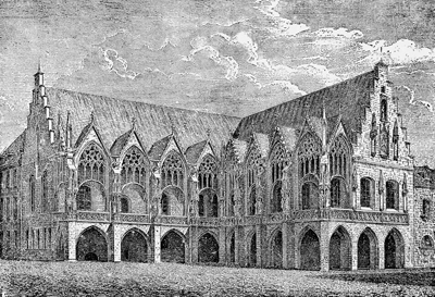
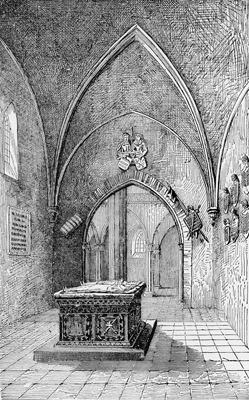
lower story of the “Rath House of Brunswick, Germany,” (Fig. 98, page 294), the upper stories will reveal something of the effect that is here suggested. The same may be seen, too, as applied to interiors, in the successive arches of the Church of San Pedro de Cardena (Fig. 99, page 296).
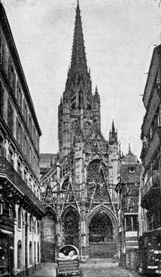
An effect, the reverse of these, in which the order of gradation is from a sharper arch upward to a flatter one, may be seen in the front of the Church of St. Maclou at Rouen, where, of three angles, the one over the lower front door is the most acute, one over a large window above somewhat less acute, and one higher up over the roof the least acute of the three (Fig. 100, page 298).
It is to be said, however, that the effect of gradations in this direction from a higher arch upward to a lower arch is less artistic than of those in the opposite direction. As has been said, the flat arch is the one that is fitted to sustain the greater weight, and the sharp arch in the roof is the one that affords the better watershed. Besides this, too, as a rule, the outlines of hills, trees, and living creatures taper toward their highest points. The effects of works of arts, even where they involve no direct imitation, should correspond as far as possible to both the principles and appearances of nature. It seems desirable, therefore, that the order of gradation from the lower to the higher stories should be the one that was first described.
What was said, a few pages back, of the use of curvature in architecture, is equally applicable to abruptness in the introduction of forms of different styles. Though appropriate occasionally, as was shown when treating of antithesis, page 31, it is much less appropriate than in painting and sculpture. In the latter arts, one is often
[The Genesis of Art-Form by G.L. Raymond, chapter XVII, page 295]
 [click here to enlarge image]
)
Fig. 99 – Interior of San Pedro De Cardena, Spain.
(See page 295)
[The Genesis of Art-Form by G.L. Raymond, chapter XVII, page 296]
at liberty to imitate abruptness or any other condition, if only it be found in nature; but in an art in which men do not take forms ready-made, and the object of which is to reduce things to systematic and intelligible order, artists must be especially careful to have it appear that this has been done.
Turning now to progress, it is comparatively easy to understand how this may be secured in poetry and music, the forms of which consist of words and sounds necessitating movement. But in painting, sculpture, and architecture, there is no literal movement. If they represent with fidelity things as they appear in nature, they can only reproduce that which takes place in a single moment of time. There are, indeed, paintings in which more than this is attempted. A fresco in the Sistine Chapel in Rome, by Boticelli, entitled “The History of Moses,” represents the prophet in six or seven different situation at different periods of his life; and one in the Campo Santo at Pisa, by Benozzo Gozzoli, entitled “Noah and his Family,” gives us at least three different events in the life of that patriarch. But such paintings have never ranked high in art. It seems to be recognized that they are not faithful reproductions of nature, and are therefore artificial.
In contrast to these, Raphael's '”Death of Ananias,” Fig. 94, page 288, will show us how there can be progress and yet no literal movement. That which is represented in the cartoon could take place at one moment of time. Yet at this moment the idea, forcibly impressing those nearest the principal figure, has not taken possession of those remote from him. The picture represents, therefore, different stages of progress in the development of the idea, or of the influence exerted by it; and it is almost impos-
[The Genesis of Art-Form by G.L. Raymond, chapter XVII, page 297]
sible to conceive of any painting or statue, however small, in which the progress of the idea in its advance to take possession of the whole body of the subject or subjects, might not be represented in an analogous way. In a human figure, the expression of the face may be in advance of that of the arms or hands, the expressions of these in advance of that of the lower limbs, while at the same time the adjustments of the clothing may give scarcely any indications of that which has begun to influence the body underneath it. (Fig. 45.)
 [click here to enlarge image]
)
Fig. 100 – St. Maclou, Rouen, France.
(See page 295)
Nor is it less possible to represent the effects of progress in buildings. In many of the English cathedrals the whole development of Gothic architecture from the Norman, through the pointed, decorated, and perpendicular, can be traced literally in
[The Genesis of Art-Form by G.L. Raymond, chapter XVII, page 298]
the different forms used in different parts. But progress in such a literal sense is not essential, nor is it always consistent with unity. When, according to the method of gradation described a moment ago, one form of arch is used above the lower openings, and another sharper development of the same over higher openings, and another still sharper over the highest, we have a representation of progress of a more desirable kind. So, too, we have the same in the interior of a cathedral, when the arches above seem to grow like limbs of trees out of the shafts below them, and when the chancel beyond the nave, to which so many lines of the walls and ceiling point, seems, with its finer elaboration of the resources of outline and its grander wealth of color in window and altar, to burst upon the vision like a flower, for which all the rest has furnished only a splendid preparation for unfoldment. In these and other ways, there are buildings so constructed, that they seem to be almost as much the results of growth and, in this sense, of progress as do products of nature with which we are accustomed to associate the two.
At the opening of this volume, in Chapter II., it was shown that the first efforts of the mind in the direction of art-composition are made for the purpose of securing effects of unity, in order to accommodate the result to the requirements of human conception. It was shown also that the occasion for these efforts arisen from the variety everywhere characterizing the natural forms of which the artist is obliged to construct his products. Everything that has been unfolded between that chapter and this, has been a description of different methods of arrangement through which factors of a form, while exhibiting variety, can, nevertheless, be made to exhibit
[The Genesis of Art-Form by G.L. Raymond, chapter XVII, page 299]
unity. But in none of these methods has there been necessitated such an absolute blending of the appearances of the two as in progress. In this the variety which in most of the arrangements is accepted as a necessary and accidental evil, becomes essential. As just stated on page 270 there can be no progress except of something that is clearly recognized to be a unity. But it is equally true that there can be none except as that which is a unity is perceived to be characterized by variety also. In progress therefore all the methods of art-composition that we have been considering seem to culminate. We could continue our subject from this point only, as was intimated in Chapter VIII., by taking up rhythm, proportion, and harmony. But each of these differs in character from the methods hitherto considered. It is a complex result involving invariably an application of all of them in combination, yet springing from them only so far as the mind is necessarily and often unconsciously moved to its action by the principles underlying them. For these reasons a satisfactory discussion of any phase of our subject beyond what has already been considered, seems to demand a different mode of treatment. It is fitting, therefore, that the course of thought pursued in the present volume should here be brought to a close.
*****END*****
[The Genesis of Art-Form by G.L. Raymond, chapter XVII, page 300]